
The new H&M flagship store is a global Project where Estudio Mariscal has been in charge of the architecture, interior, furniture and lightning design, as much as the signage and visual identity. We have created a shocking space full of thrill and surprise where people can feel comfortable and the garments find its place. Design at the service of the store. A fresh pop language lives together with the majestic spirit of the building. The contrast between the ancient and the new style is one of the challenges we have to tackle and will become one of the guidelines through the project. We cross the entrance through a led screen tunnel that led us from the street to this new H&M space. A big explosion of light and color that becomes a virtual store front, a dynamic sign that lacks on the façade.


The recovered central atrium gives air and light to the space. Here, the upper glass dome and specially the metal stairs enhance the vertical axis connecting all the floors, from bottom to top. The stair going up looks solid and imperial. It seems to be waiting Marilyn Monroe to walk down its steps. The other going down to the basement loses it symmetry and takes the appearance of a playful Escher labyrinth.


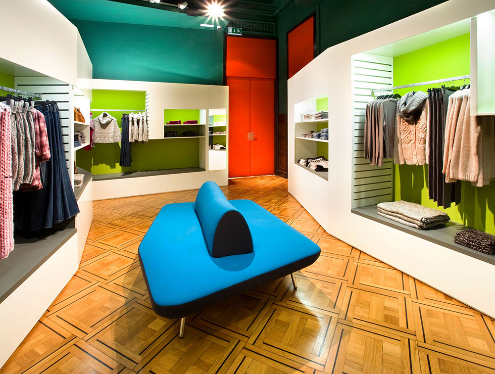

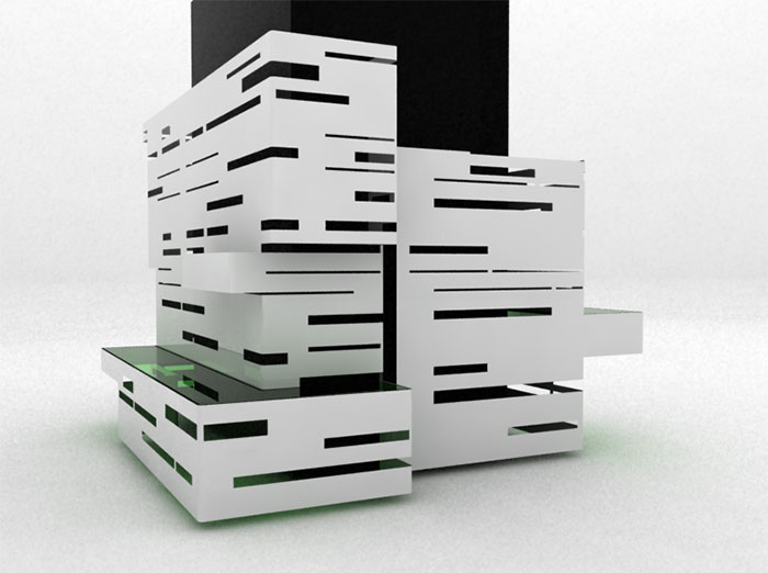
All the elements are removable. The interior walls are covered by a metallic puzzle of drilled panels that overlaps the existent architecture not hiding it completely. It’s a modular and flexible system that never loses its rhythm. The design of the furniture shows the same language of drilled metal panels and colored glass. Both are hard and cold materials that underline the contrast with the original material of the building, stone and wood.
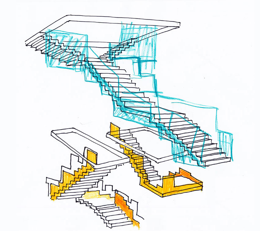
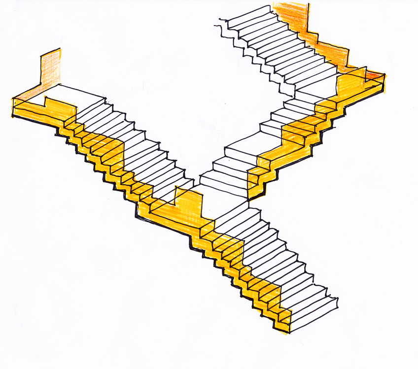

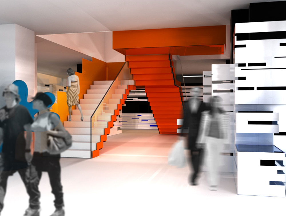


We have had complete freedom through all the process that has come up as a design lab in which Estudio Mariscal has investigated, experiment and played. Not only with the design of the different elements but also with the way in which garments could be displayed or the experience that the customers may have inside a store such as this.



- Client: H&M,
- Location: Barcelona, Spain
- Date of project: 2008
- Surface: 1720 m2
- Architecture & Design: Estudio Mariscal & Lara Pérez-Porro
- Collaborators: Silvia del Val
- Constructor: Dula Bau
- Retail equipment: Dula Ibérica
- Structural Engineer: nb35
- Construction management: More MC Arquitectura-Ingeniería
- LEDs provider: BARCO
- LEDs installation & assembly: SONO
- Lightning: iGuzzini
- Restoration works: Artecc
- Sculpture construction & assembly: Taller de Escultura Pere Casanovas